


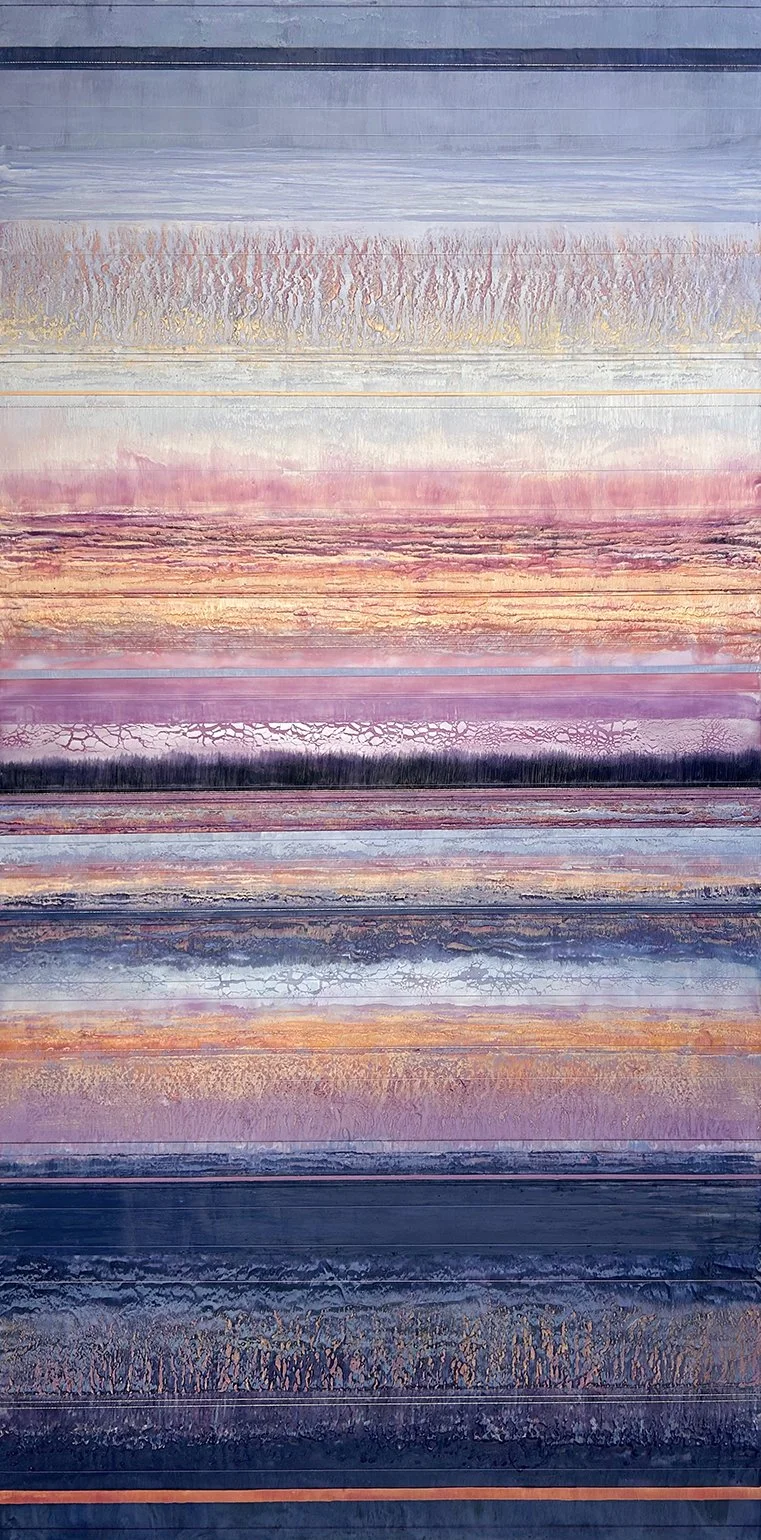
Art: Susan Auriemma
A VIRTUAL EXHIBITION
SUMMER & THE SILENCE
Juried by
Payal Thiffault & Michelle May of Juniper Rag
FOR BEST VIEWING
keep scrolling for a continuous view of all artists or view each by clicking on the artist image
view full images by clicking image boxes. recommended viewing on a desktop
Brian Sager

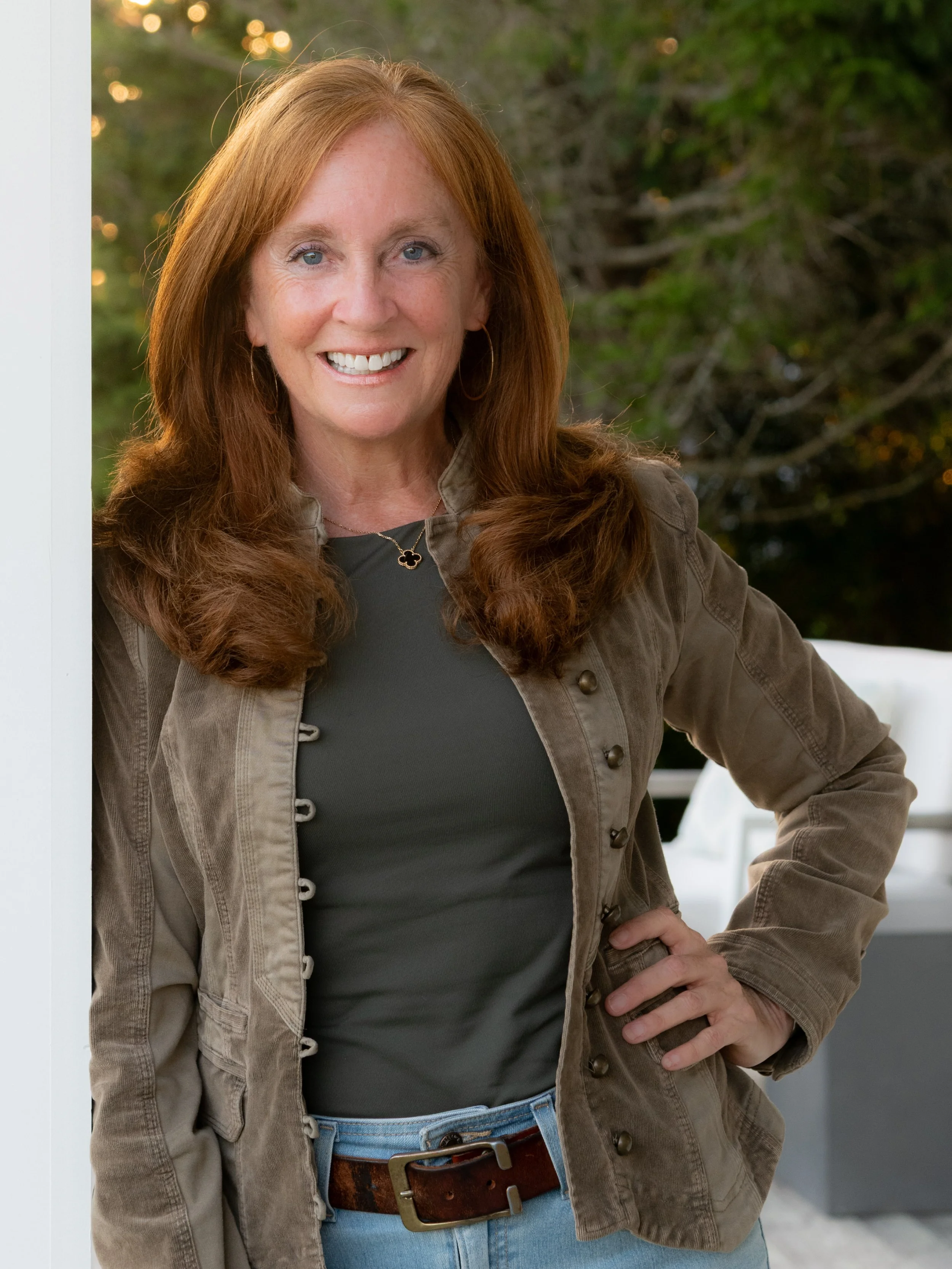
Susan Auriemma

Zach Raley
Keri Anderson

Rebekah Davis

Marisa McCarthy
Simone Scholes

Kaddy Tsang

Sue Dion

Chelsea Bradway

Hilary Hanson Bruel

Jane McKinnon Johnstone

Benjamin Erlandson
GALLERY
→ keep scrolling for a seamless gallery experience ←
click to view images in lightbox, recommended for viewing full integrity of the artists’ compositions

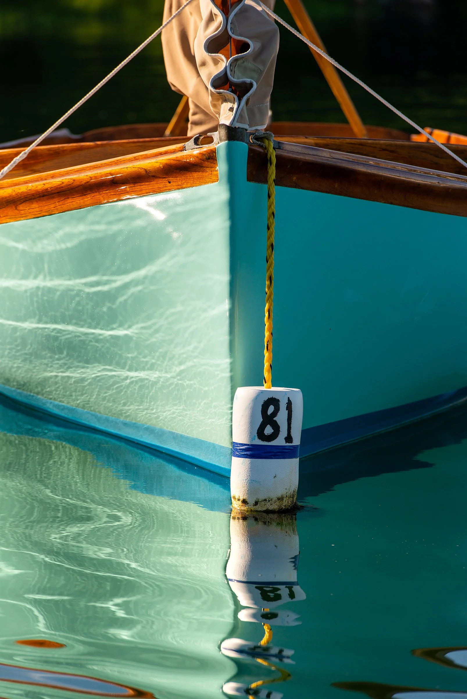
BRIAN SAGER | Cohasset, Massachusetts, USA
Curator’s Choice Award
Golden Hour Sail Tortola
18x12”, photograph fine art paper print, 21x15" framed, $595
Miacomet Shack
16x24", photograph on fine art paper print, 19x27" framed, $1095
Quissett Morning Reflection
18x12", photograph on fine art paper print, 21x15" framed, $595
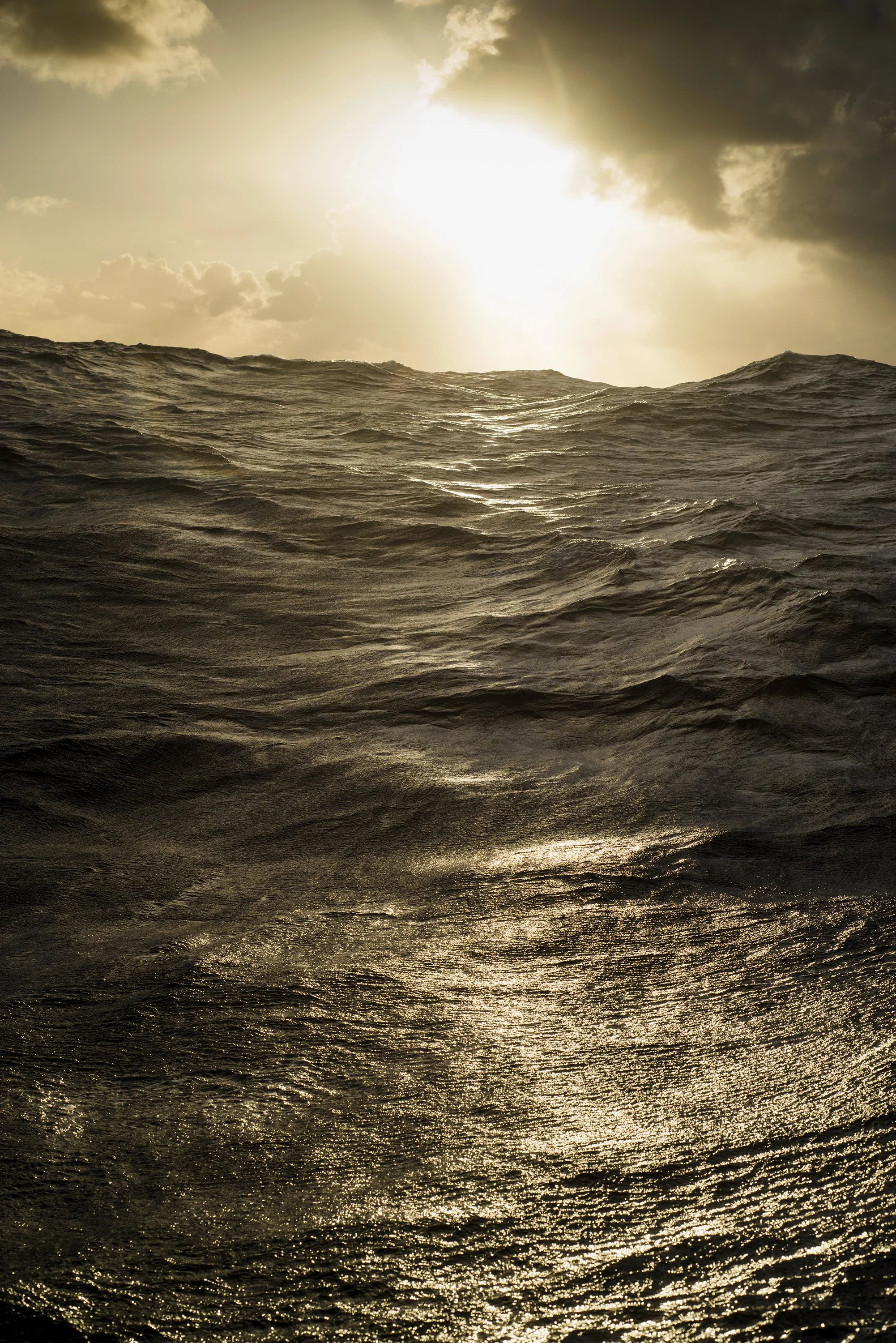
North Atlantic Cold Front
12x18", photograph, unframed dye-sublimation metal print, 19x27" framed, $775
The ocean, a world of beautiful contrasts, is both captivating and indifferent, rhythmic and chaotic. It's one of the last wild frontiers, and it shapes those who venture into it. My work captures the dynamic interplay between order and chaos, distilling fleeting moments into lasting images.
I seek out the unique intersections of time, place, and perspective that best express my connection to the water. The resulting images serve as both symbols and documents—representations of adventure, tradition, and the enduring relationship between humanity and the natural world.
My ultimate aim is to convey not just what the ocean looks like, but what it feels like. At its core, my photography is about the balance between human instinct and nature's vast, uncompromising presence. In a world focused on what is fleeting, I choose to focus on what is enduring—the beauty, resilience, and possibility that define our place in it.
Award-winning nautical photographer Brian Sager creates the majority of his fine art photographs from the water, capturing the beautiful intricacies of the sea. Established on the island of Nantucket and working internationally, Brian's career began with a lifetime of sailing experience and over 10,000 miles of offshore sailing. His profound understanding of sailing and a keen artistic eye allow him to create masterful images with lasting impact.
Whether he's crewing in a classic yacht regatta, sailing offshore between New England and the Caribbean, or paddling through coastal tidal creeks, Brian uses light to showcase the often unsung details of the nautical world. He captures the raw energy of a storm-driven wave, the quiet tension before a yacht race, or the shifting moods of the Maine coastline. Through his photography, Brian encourages others to engage with the beauty and complexity of the sea.
CURATORIAL NOTES:
Brian Sager’s work resonated with us because it bridges the gap between human experience and the world of sailing, offering viewers an intimate perspective of life on the water that is both dynamic and contemplative. His images transform the sea into a living subject, revealing textures, intricate water patterns, as well as movements and stillness that might otherwise go unnoticed. There’s a meditative quality to his photography—moments of anticipation, tension, and revelation—that resonates deeply with the themes of reflection and stillness of Summer & the Silence. You can almost smell the salt air and feel the mist on your face with the warm sun of golden hour when you take them in.
Including his work in the exhibition allows audiences to connect with environments that are they many not have a chance to experience, sailing a monohull on the Caribbean waters at the end of a long day, celebrating the stillness of the harbor when the moon is full and relaxes the water or bare witness to the fragility of our shorelines. Sager’s ability to distill emotion and narrative from his experiences by the water aligns perfectly with our exhibition’s focus on subtlety, presence, and the unspoken rhythms that shape our summer days. Brian’s photographs invite viewers to adventure, pause, observe, and feel the profound interplay of light, motion, and mood—making them an essential part of this collection.


ZACH RALEY | Needham, Massachusetts, USA
Curator’s Choice Award
Burn
48x55”, acrylic and oil paints, epoxy resin, NFS
Nilla Wafers
60 x 72”, acrylic paint, epoxy resin, oil pastel, canvas on wood, NFS
Zach Raley, a 17-year-old artist based in Needham, Massachusetts, uses epoxy resin and paint to layer emotional scenes from his childhood on a larger-than-life scale.
His works Burn and Nilla Wafers, both self-portraits, depict the often unseen moments of deep emotion during stereotypically happy summer scenes. While many artists focus on vibrant beach days or idyllic summer landscapes, Zach highlights the parts that are usually left out: moments of depression, anxiety, and overwhelm that persist regardless of the season. Through this contrast, he challenges the idealized version of childhood by presenting his own emotional reality. Zach also uses color intentionally as a vehicle for meaning. In Burn, which was awarded a National Gold Medal by the Scholastic Art & Writing Awards, he draws on Renaissance-inspired colors: red symbolizing looming doom, lemons representing wealth, and blue evoking sadness. The painting becomes a contemporary critique of American childhood and the pressure to succeed at a young age.
Zach’s work has received national recognition, and in addition to Scholastic honors and the 2025 RIT Art and Design Award, he was recently named one of Art New England’s Top Ten Emerging Artists for 2025. He continues to show in the Newport, Rhode Island area, with strong ties to CUSP Gallery, and as a member of the Newport Artist Collective, he is committed to creating honest works that show the often overlooked realities of life and all its emotion.
CURATORIAL NOTES:
Zach Raley’s work emerges from an undeniable pressures that weigh heavily on young adults today—the expectation to succeed quickly, to find a clear path, and to navigate a world that feels both oversaturated and unstable. It is hard for us to realistically imagine what the impact of social media is for young artists, because we were so siloed during our formitive years without the web-o-verse. Zach’s statement reflects a deep awareness of these cultural tensions, balancing the vulnerability of self-discovery with the demand for resilience in the face of constant comparison and unending societal benchmarks. The depth for each artist depends on so many personal factors. For Raley, we see art becomes a space of both release and confrontation and a way to translate personal uncertainty into visual language. His work resonates obviously because of the content, colors and the pause, but they also mirror the struggle of a generation—one learning to measure itself not only by external validation but also by the authenticity of its voice, like the honesty of Zach’s self-portraits.
In today’s art market landscape, where visibility often seems to hinge on algorithms, networking, and access rather than solely on merit, young artists like Raley are forging paths that demand both adaptability and courage. When we met Zach at Art Newport as jurors, we were stunned to learn of his age and that these paintings were accomplished by a high school student. Zach was one of our top choices for selection at the exhibition. No doubt, we will see a lot more of Zach Raley.
By creating a space rooted in intentional curation and community, Juniper Rag provides artists like Raley with more than just sn exhibition—we offer validation—because holy cow, is Zach talented, dialogue—reach out to Zach, and the freedom to take risks—we celebrate this in every opportunity. This freedom we have and the ability to share Zach with our community is vital, not only for nurturing individual artists but for shaping the cultural landscape itself, reminding us that the future of art depends on amplifying voices that are honest, raw, and deeply connected to the complexities of their time.

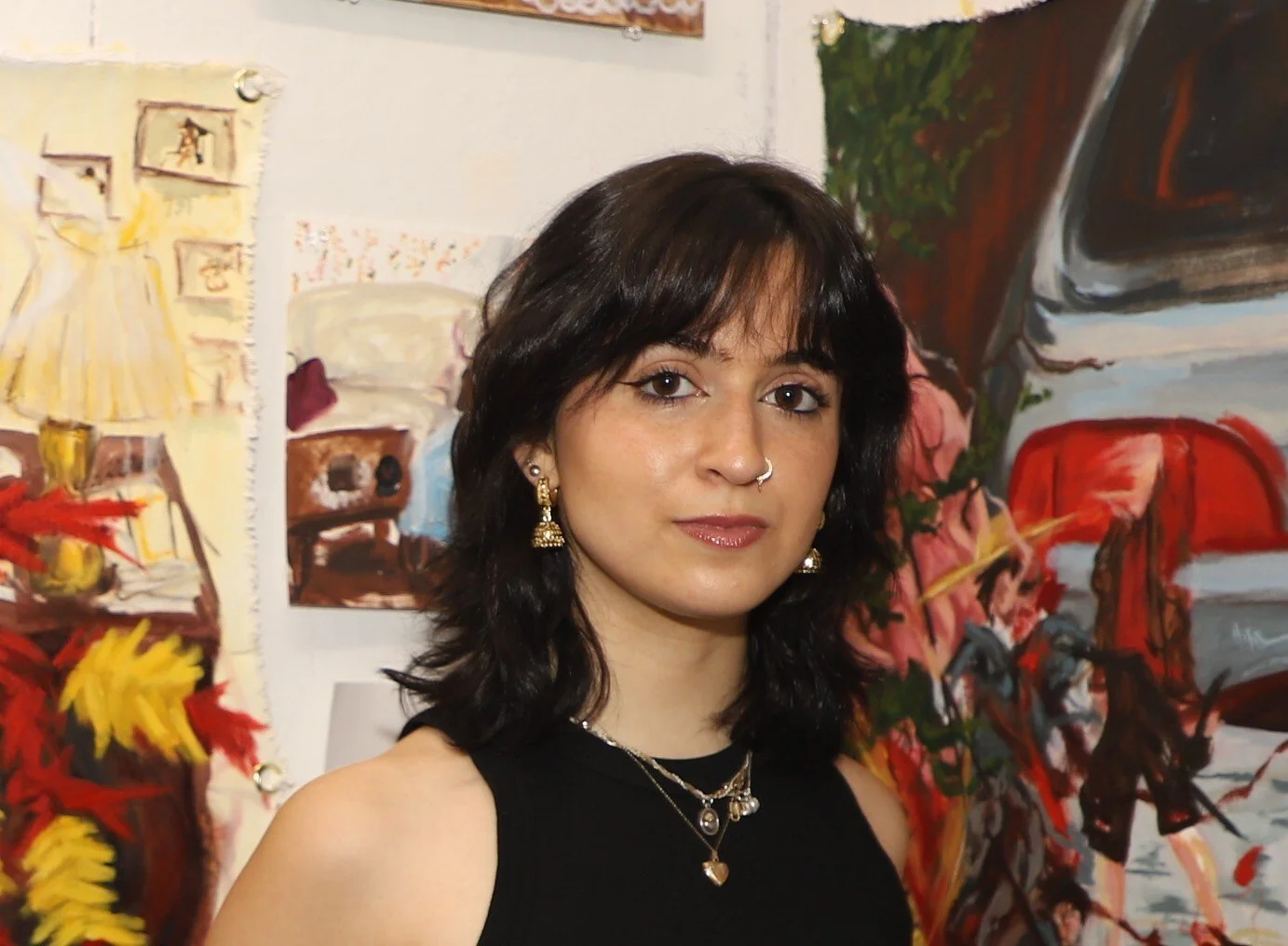
SUSAN AURIEMMA | Middletown, Rhode Island, USA
Curator’s Choice Award
Shoreline 02
24x40”, photograph, dye sublimation on matte metal in white wood float frame, $2100
Shoreline 01
24x40”, photograph, dye sublimation on matte metal in white wood float frame, $2100
Fog 01
20x20”, photograph print on watercolor paper in a white wood shadow box frame, $1250
Susan Auriemma, a native Rhode Islander and occasional New Yorker, picked up her first Nikon when her first child was born and hasn’t put it down since. When Susan isn’t shooting landscapes and waves, she is busy shooting interiors and architecture as well as food photography for her clients.
Susan’s fine art photography features softened textures and colors that evoke a sense of calm. Growing up just steps from the ocean, Susan developed an innate connection to the soothing effects of waves—their sights and sounds fostering a deep sense of tranquility. Through her fine art pieces, she brings this serenity into the home.
Images from the Echoes of Light Collection reflect the artist's intention to inspire peace. Susan achieves this effect by softening images of waves and water using a technique known as Intentional Camera Movement (ICM). This method subtly blurs the image, preserving enough detail for the subject to remain recognizable while avoiding complete abstraction.
Pieces are presented in one of two ways: Many are printed as dye sublimation on aluminum in a float frame designed to evoke the impression of a painting rather than a traditional photograph. By eliminating the need for glass between the viewer and the image, it suggests the appearance of a canvas painting. Alternatively, images are printed on watercolor paper with a deckled edge and presented in a shadow box style frame as a water color painting would be. Many viewers, upon seeing this collection, initially believe the images are paintings rather than photographs. The artist considers this the highest compliment, as it confirms her intention has been successfully realized.
CURATORIAL NOTES:
Susan Auriemma’s photography invites us all into a gorgeous space of quiet reflection and calm by serving up images that you just want to touch, or float in. Drawing inspiration from her lifelong connection to the ocean, she captures landscapes and waves in a way that emphasizes all of this calm and subtle emotion. Her signature softness is achieved both in-camera and through her careful presentation choices. This ICM method allows light, texture, and motion to blend in a painterly manner, creating images that feel alive yet meditative. (Please make sure you are clicking on the images to view full size.)
Beyond photographing, Susan considers every detail and material of her printing process as it relates to the viewing experience. Some images are printed on watercolor paper with a deckled edge and framed in shadow-box style, echoing traditional watercolors. The paper’s subtle texture absorbs light in a way that enhances the soft, tranquil quality of the image, while Susan’s calculated presentations further blur the line between photography and painting. In other works, she uses dye sublimation, a printing process where a solid image dye is heated and transformed directly into gas, bonding with the surface of materials like metal. Her images on aluminum produce a luminous surface that floats the image, further enhancing the quality her ICM techinique was going for, completely evoking the impression of a painting. Removing glass to inhibit the viewer was one last step in her very smart process. Prints on metal just illuminate the work.
Because we have a printing background and a wealth of user experience knowledge, we celebrate Susan’s thoughtful techniques to achieve her end results. Through researching and knowing what is possible, Susan transforms her photography into a heightened and sensory delivery of calm and contemplation that tempts a nibble, a touch or complete physical submersion to allow that dreamy water to caress your skin. This processes allows her to soften the visual experience without losing the integrity of the subject, offering us all a quiet moment to pause and engage deeply with the imagery, we don’t have to think about the magic formula behind each image. Lastly, let’s celebrate how Susan’s work challenges the boundaries between photography and painting, demonstrating how technical mastery can be inseparable from artistic intention.

KERI ANDERSON | Worcester, Massachusetts, USA
The Weight of Silence
30x58”, acrylic on canvas, $800
I am constantly evolving as an artist and art educator. Some of my previous work involves exploring painting, as well as live painting, commissioned portraits, sculpture and mixed media, Some of my themes and influences deal with portraiture, self-portraiture, and landscape. I aim at the complications of life and sensual nature of art, through a combination of texture, symbolism and narrative. I express myself through experiences, what I see and the people I meet, the memories I have about a particular event or a visual memory of what I thought I saw. I try to capture moments of being in the present moment in nature or the city. I try to capture the soul of each object, person or landscape so it becomes a reinterpreted moment in time.
This piece was painted entirely with a painting knife. There is a visceral current that runs through Keri Anderson’s work—a raw and honest power that refuses polish or restraint, as if her essence and energy has transference from her and out to the canvas. What she creates doesn’t just whisper, it confronts, it pulses, and demands your presence. In a world too often softened or censored, Anderson’s art dares to stay unfiltered, reminding us that truth, in its purest form, is both beautiful and disruptive.
CURATORIAL NOTES:
We find a profound value in witnessing an artist’s evolution over years—seeing how their work shifts, matures, and responds to the circumstances of their life. When we know an artist personally, not just by their finished pieces shown on the internet, but by their personality, struggles, and triumphs, the artwork takes on a deeper resonance. Brushstrokes knowling carry the weight of all artists’ resilience, colors reflect lived emotion, and their compositions embody tensions of survival and the range of emotions. This acute awareness really transforms the act of viewing Keri’s work into something more intimate, but a dialogue not only with the art itself and with the life that shaped it. It is always an honor to view and share Keri Anderson’s work.
Sharing this kind of intimacy—the awareness of an artist’s personal journey and the vulnerability embedded in their work is one of the most vital forces within all of our artist communities. This very thing fosters connections beyond surface-level aesthetics, allowing peers and audiences to see not just the product but the real human stories behind them. When artists share their challenges, breakthroughs, and evolving practices, they create an electric collective space of inspiration, trust, empathy and support. This openness rips at the myths of the solitary artists and totally highlights the power of shared growth. We are here for that 100%.
We are allowed to witness one another’s evolution as it becomes fuel for creative courage and solidarity. In this way, intimacy isn’t just a byproduct of community—it’s the very fabric that binds it together.

REBEKAH DAVIS | Boston, Massachusetts, USA
Botanical Hush in the Berkshires
20x28”, paper cuts, $1000
Midday Beneath the Fronds
13x16”, paper cuts, $450
Nothing Stirs at Noon
13x16”, paper cuts, $450
Rebekah Davis a Boston-based paper artist specializing in paper cutting. As a self-taught artist her journey in paper cutting began with a greeting card almost ten years ago. Her current work blends a love of photography with paper cutting to create one of kind pieces. Most evening you can find her cutting paper amidst a collection of plants, a frequent source of inspiration. Her work has been featured in local art shows.
As a paper cutting artist, I strive to capture the beauty of everyday moments and the interplay of nature and human made objects in our surroundings. Each piece is constructed from a single sheet of paper, like painting with a knife. Black and white images enable me to capture both light and shadow. Paper can be unforgiving medium; it can only be cut one. Each cut serves a purpose. These pieces depict moments of pause in the summer heat and the shimmer of afternoon sun. I hope to evoke the feeling of stillness in heat, with humidity at its peak.
CURATORIAL NOTES:
Rebekah Davis, creates the most intricately hand-cut works whose complexity often eludes photographic reproduction. When viewed online the subtle dimensionality, delicate edge work, and interplay of light and shadow inherent in her pieces can flatten into the appearance of high-contrast, vector-based graphics—particularly to those trained in graphic design, who may instinctively read them through a digital lens, like we did when we first looked at them. This phenomenon underscores how a viewer’s professional training, visual literacy, and lived experience mediate perception--shaping both interpretation and aesthetic response. Encountering Davis’s work in person would reveal an entirely different experience. The precision of the cuts, the spatial layering of papers, and the fragile nature of the media create an entirely different visual experience that cannot be replicated in 2D documentation like a photo. This just reinforces the irreplaceable value of direct engagement with original art as often as you can.
MARISA MCCARTHY | Somerville, Massachusetts, USA
Meatball
14x20”, oil on linen, NFS
I’m Gonna Take This One Home
40x54”, oil on canvas, NFS
I Can Never Have It In The Way That I Want
40x50”, oil on canvas, $6000
Marisa McCarthy is a Boston-based multidisciplinary artist. She graduated from the combined-degree program at Tufts University and the School of the Museum of Fine Arts where she received a B.A. in Applied Environmental Studies and a B.F.A. in Studio Art. In her art practice, Marisa works primarily in oil paint and jewelry smithing which she uses to explore cultural identity and environmental themes.
I Can Never Have It In The Way That I Want and I’m Gonna Take This One Home are the first works in a new series documenting my friends and family who identify with hybridity and experience what I call “interstitial” identity- ways of existing that are found between grains of sand, that fall between cracks, that are specific and singular, complex and overlooked. My models each experience this state of in-betweenness and unbelonging in relation to race, gender, or sexuality. The intersections of these identities further isolate and complicate their perceptions of identity until the idea of the hybrid is the most accurate and comfortable self descriptor. In these works, I juxtapose the hybrid figure against visual materials from the model’s cultural history and memories which encapsulate their sense of identity. These two portraits capture my models sharing moments of vulnerability in the humid lull of summer in New England. Through the fracturing of images, these works focus on the feelings of chaos, unrest, and self discovery that are amplified by the heat of the summer.
CURATORIAL NOTES:
Marisa McCarthy presents a series of very intimate portraits for Summer & The Silence that explore the complexity of human experience that many young people today have the freedom and autonomy to explore more publicly. We know that in places it is still very dangerous to share the most intimate parts of oneself. Her works I Can Never Have It In The Way That I Want and I’m Gonna Take This One Home document friends and family who navigate the spaces between societal categories—race, gender, sexuality—illuminating the singular, often overlooked ways they exist in this world, may alone without a support system. Contrasting that with hybrid figures against layered visual materials drawn from her models’ own histories and memories, she also captures the tension between internal identity and external perception. The humid intensity of a New England in summer she speaks of becomes a metaphorical and a literal frame for her work, amplifying all of their feelings of chaos, unrest, and self-discovery that define these portraits. We all know that feeling at the height of heat and struggle for comfort. The models and the artist are exposed.
We see a strong resemblance in Meatball to the work of Francis Bacon. Like Bacon, McCarthy seems to be drawn to the vulnerability of the human form, the fragmentation of the bodies in the other works seems to be a vehicle for psychological expression, and frustrations with society at large. Bacon’s figures are often tormented and isolated and McCarthy’s subjects reveal and explore identity through purposeful relational and subtle cultural markers, blending personal narrative with a social commentary. The “fracturing” of McCarthy’s images—both formal and conceptual—can also be compared to Bacon’s unsettling distortions, while simultaneously offering moments of tenderness and recognition. In this way, McCarthy’s work extends into the terrain of contemporary identity, illuminating the nuanced spaces “in between” that are defining many brave people in a generation, where others in the past did not dare to go.

SIMONE SCHOLES | Mansfield, Massachusetts, USA
Waiting For The Storm
30 x 24”, oil and silver leaf on cradled board, $1875
Mawu
16x20”, oil and silver leaf on cradled board, $500
Sunshine And Polka Dots
16x12”, oil on cradles board, $500
My art over the years has been mainly focused and inspired by women, fashion, and textiles. I’ve always been Fascinated with people and what’s beneath the surface against how they want to present themselves to the world. I strive to capture a mindful moment or a twinkle that leaves you wondering – allowing the viewer to ponder recognition.
I’ve spent time over the last few years developing a loose, more painterly style and work on a process that gives me the details I crave, in the under drawing and prep, but allows me to paint in a bolder, much more free style. I paint with Oil on wooden board, I enjoy the smoothness of the surface and use enough linseed oil to help the paint flow in precise bold brushstrokes, focusing on color and shapes. Currently, I have been exploring metal leaf in a slightly different way, exploring it to bring luminosity by layering linseed rich paint over it.
Simone began her career at Art College majoring in textile design but was very quickly pulled onto a different track in the corporate world of the fashion industry. In a serendipitous turn, her corporate career brought her on a journey to Vietnam many years later, where she quite unexpectedly fell in love with a painting hanging in a restaurant in Ho Chi Minh city. It sparked a new creative interest in Simone and where previously she had mainly worked with watercolor, it intrigued her to explore oil paint.
Using bold brushstrokes and plenty of Linseed oil, she plays with familiar shapes and light to create different personas. Using a combination of materials and textures, her fashion and textile inspired artwork aims to capture both the outward beauty and the inner mystery of human beings.
Her developed, recognizable style and been in numerous local New England shows and publications including the Attleboro Arts Museums 8 Visions and Boston City Hall Emerging Artist show.
CURATORIAL NOTES:
Whenever we speak with Simone Scholes about her paintings we gain more insight into her process and what drives her to choose her subjects. Photographs of strong women that exude confidence and display a sense of “being present” and autonomous are drivers for her choices. What we see visually in the paintings is also Simone’s intrigue in who they are as people, their power and their prowess and perhaps their vulnerabilities.
Her loose layered brush strokes are as confident as her subjects. Also inspired by fashion, color and pattern, each piece echos traces of her background in textiles, very vogue and true to her core. The finished oil pieces are luxurious and buttery to look at. If you have not seen them in person, we highly recommend seeking them out.

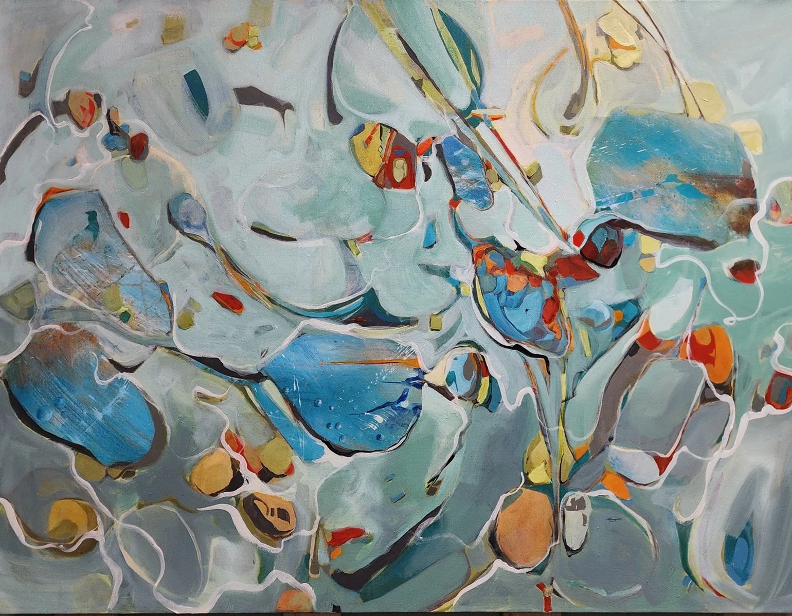
SUE DION | Uxbridge, Massachusetts, USA
Low Tide
36x48", acrylic, $2995
Sea Pebbles Tryptic
9 x 17", acrylic, $425
Dion’s paintings draw from two great American traditions, abstract expressionism and plein air. Her singular approach to the “lost edges” in abstraction communicates her intense focus on the marginalized and awakens our awareness of what is on the edges and not apparent at first glance. The color scheme in her paintings is equally sophisticated: any immediate sense of sweetness in her pastels or more saturated colors gives way, on a second viewing, to unexpected depths and darkness.
Sue shares her passion for painting through teaching and mentoring in her Uxbridge studio and as a member of the teaching faculty at the renowned Worcester Art Museum.
As a painter working in an expressionistic style, I expend most of my energy at the easel exploring the mysteries of nature and enjoy incorporating the subtle suggestion of floral forms in my paintings.
My paintings often suggest a hidden reality in emotion and a narrative that invites viewers to project their own feelings and meaning onto the work. Thereby creating their own interpretations and a sense of nostalgia for moments from their own past.
I am captivated by the common threads found in all forms of art, the melodic line of music, the compositional structure of writing, the grace and fluidity of dance and I enjoy expressing these commonalities in my work.
Sue Dion was born and raised just outside of Boston, Massachusetts, where she remained until her early twenties working alongside her siblings, parents and grandparents operating a wholesale florist business. While the demands of planting, nurturing and bringing flowers to market left little time or inclination for artistic pursuits, it is these very activities which instilled in Dion two traits essential to the life of a successful artist; a strong work ethic and a keen eye for beauty.
CURATORIAL NOTES:
Sue Dion’s practice moves through subtle shifts of perception, finding resting places in her textures, forms, and fleeting moments. Her work traces experience—what lingers in memory, what emerges in quiet observation—and turns them into visual encounters that are at once intimate and interesting, especially successful in Low Tide.
For Summer & the Silence, Dion shapes a space where her subtle shifts in color and shape draw the viewers eye, inviting us to lean in, to sense the delicate gestures of light and paint, and to discover small macro sections of her work.

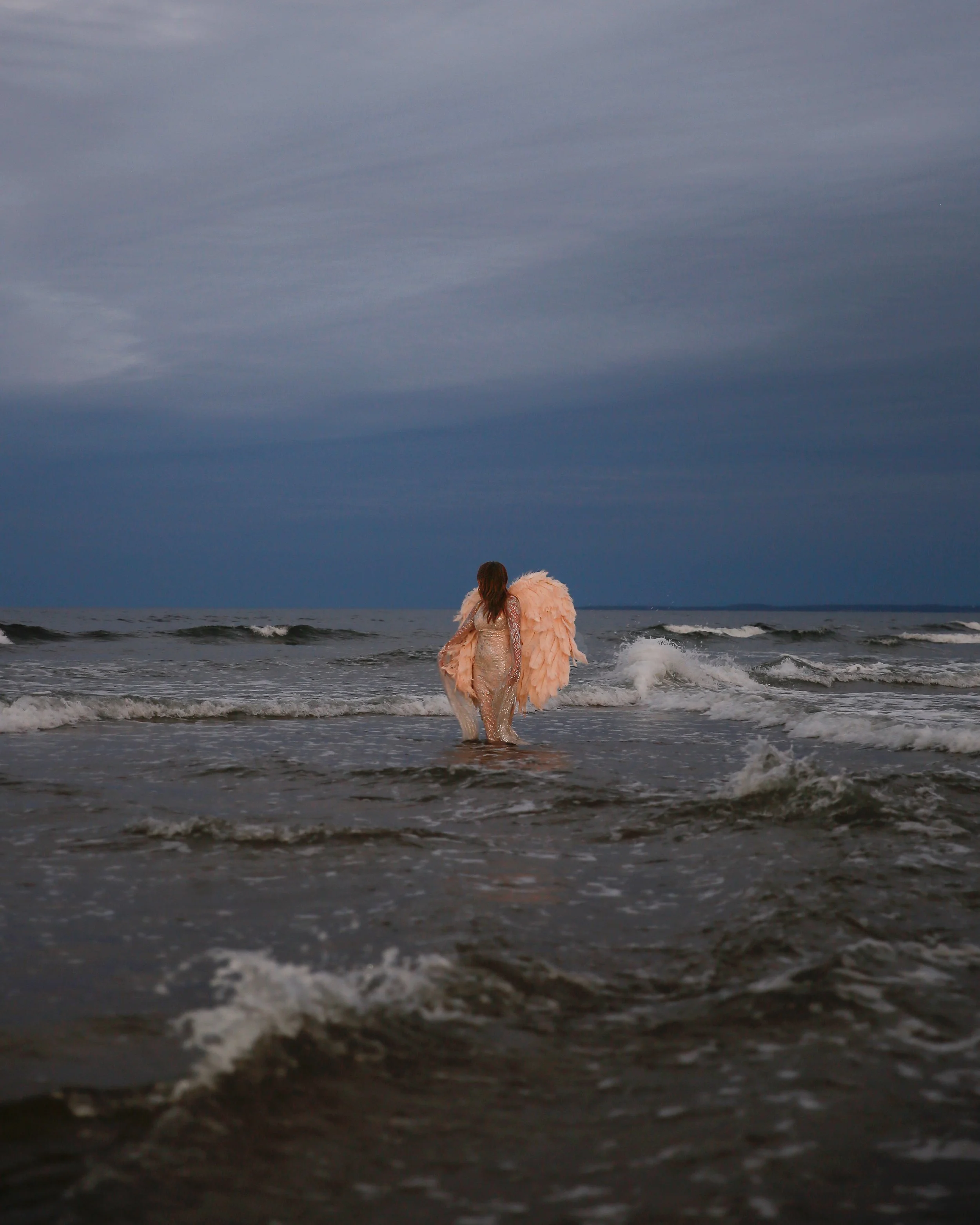
CHELSEA BRADWAY | Southborough, Massachusetts, USA
Angel of the Sea
30x24”, color photograph, $695
Angel at Play
24x30”, color photograph, $695
The Sea Can Do Craziness
30x24”, color photograph, $695
Chelsea Bradway is a whimsical, out-of-the-box artist and photographer who has a studio with two other artists in Southborough, Massachusetts, Apothecary Artists Gallery. Bradway explores themes of female empowerment, color, and imagination through her photographs and sculptures.
Within these seascapes, figures with angel wings appear as literal presences. They are not digital constructions or metaphors, but encountered moments where the mythical enters the mundane summer landscape. These winged figures transform the work from pure documentation into something more mystical, suggesting that the sacred already exists within our everyday experiences of heat, light, and horizon.
This work holds space for all of summer's contradictions—its overwhelming presence and its fleeting nature, its external beauty and its internal resonance. Through these images, I invite viewers to consider not just what they see, but what they feel lingering in the spaces between light and shadow, between the seen and the sensed, between the human and the divine.
CURATORIAL NOTES:
Chelsea Bradway’s photographs of women in wings in the ocean evoke a blend of ethereal fantasy and grounded vulnerability. The imagery feels like it totes the line of fantasy in reality —angels suspended between water and sky—yet the presence of the ocean introduces an element of raw, natural power and she captures this time of day well. The mood is successful. The wings suggest freedom, transformation, or a spiritual transcendence, while the water conveys emotion, fluidity, and the subconscious contrasted with danger and the unknown. There’s a quiet tension in her work between stillness and movement, fragility and strength, creating a visual narrative that feels both intimate and universal, especially for those that enjoy fantasy. We celebrate Chelsea’s message.
At Juniper Rag, we think Chelsea Bradway’s work is important to take in because it proves that whimsy and seriousness are not opposites, but powerful companions—inviting viewers to delight in the unexpected while confronting deeper truths about identity, strength, and our human connection. Chelsea chooses some hot topics in her larger body of work as basis for her storytelling and we see her photographs evolving over time.


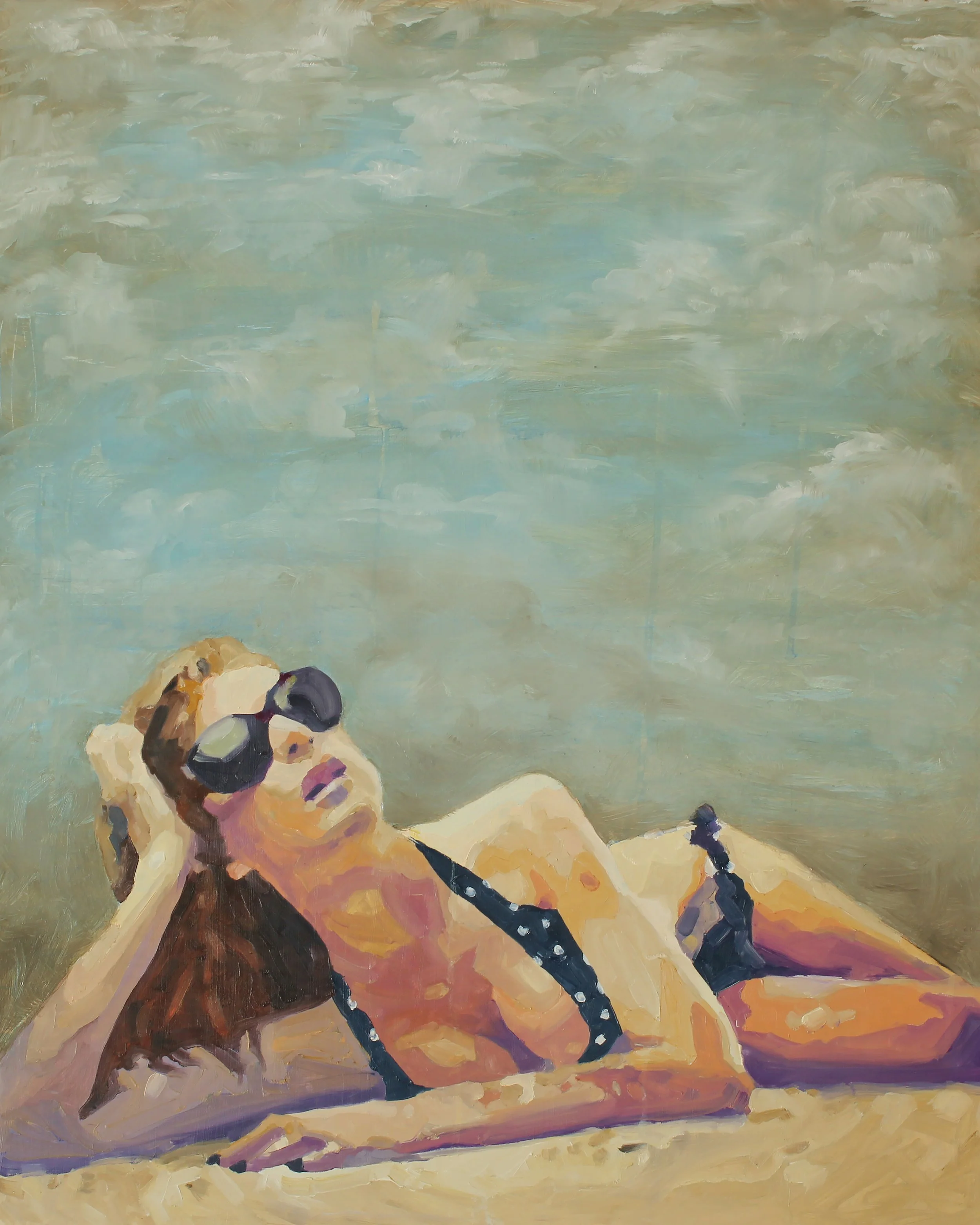
KADDY TSANG | New York, NY, USA
Sands of Time
18x24”, digital photography, $800
Costal Mirage
18x24”, digital photography, $800
Mist Green
24x18”, digital photography, $800
Kaddy Tsang was born and raised in Hong Kong and discovered her passion for photography after moving to New York City in 2010. Transitioning from a career in fine jewelry and graphic design, she immersed herself in the art of photography, refining her skills through extensive training with renowned photographers and coursework at prestigious institutions.
Kaddy’s journey behind the lens has been defined by versatility and a keen eye for storytelling. Over time, her artistic vision gravitated toward nature’s beauty, where she finds endless inspiration.
Her work has been exhibited in galleries across New York and recognized internationally. Notably, she earned nominations three years in a row at the 16th, 17th, and 18th International Color Awards, and received an Honorable Mention in the 17th edition—solidifying her place in the global photography community.
Kaddy's artistic journey is driven by a fascination with the dynamic interplay of light, color, and texture in the natural world. Each photograph is a study in contrast and harmony, capturing the subtle shifts in nature's palette. Her work is deeply influenced by the tranquility of oceanfronts, the mystery of woodlands, and the majesty of mountains. She strives to create images that resonate with a sense of peace and introspection, encouraging viewers to connect with the serene beauty of the environment. Photography for her, is a medium through which she expresses the profound connections she feels with the landscapes she explores, aiming to preserve and share fleeting moments of natural splendor.
CURATORIAL NOTES:
At first glance, we were attracted to Kaddy’s photographs. The sublime colors and softness drew us in and the tonal transitions merged with the blurred pixels engaged us further. These landscapes could be almost anywhere coastal, which makes them very versatile for any collector. They exude summer walks at low tide, a very peaceful time of day by the water. When viewing the images they appear to be paintings, possibly encaustic work because they have that waxy glaze quality. Kaddy uses light and color and her camera to manipulate these wonderful landscapes, transforming what we see with the eye to artwork that is dreamlike. The soft lighting and serene feeling we received captured the essence of this call.
HILARY HANSON BRUEL | Needham, Massachusetts, USA
Browns Bank
16x12”, encaustic with thread and pastel on cradled wood panel, $575
Morning Light
14x11”, encaustic with thread and pastel on cradled wood panel, $475
Magic Hour
36x18”, encaustic with thread and pastel on cradled wood panel, $1800
Hilary Hanson Bruel is a Boston area artist who resumed painting following a career in graphic design. Her multi-layer encaustic paintings are studies in color, composition, and texture that highlight the unique properties of the medium, and are informed by her background in both fine arts and graphic design.
Using only bands of varying widths and textures — including strands of thread strung across the surface of the painting — Hilary challenges herself to create a sense of space and distance while pushing her subject to the edge of abstraction. She has painted over a hundred of these summer seascapes in varying sizes and color palettes, and has yet to tire of the subject. The rhythm of sea and sky provides a consistent design framework with endless possibilities for her as an artist, while simultaneously evoking unique memories and places for each viewer.
Hilary’s work has been exhibited at the Art Complex Museum, the Attleboro Arts Museum, the Danforth Art Museum, and Truro Center for the Arts, and is shown regularly at Gallery Twist and Galaray House. She serves on the boards of the Needham and Newton Art Associations, and is a member of New England Wax. Hilary has B.A. in Visual and Environmental Studies from Harvard University.
CURATORIAL NOTES:
Hilary Hanson Bruel’s encaustic artwork is important to see because it reveals the timeless yet experimental power of one of the oldest mediums in art. Her work transforms layers of wax into luminous surfaces that hold memory, depth, and texture, inviting viewers to look slowly and discover subtle details hidden within. In a world that often demands immediacy, her encaustics remind us of the value of patience, process, and material presence—an experience both grounding and transformative.
This work resonates deeply with Summer & the Silence because it embodies the quiet power of stillness and reflection that the call for art seeks to explore. Her layered surfaces suggest the passage of time, the hushed presence of memory, and the beauty that emerges in these spaces between words or moments. Hilary’s wax paintings invite contemplation and mirror the season’s silences. One more element to note is Hilary Hanson Bruel uses a fine thread to carve exact straight lines into her encaustic surfaces, adding a striking sense of precision and structure to the organic depth of her work, symbolic of a need for order and definition in the strata.


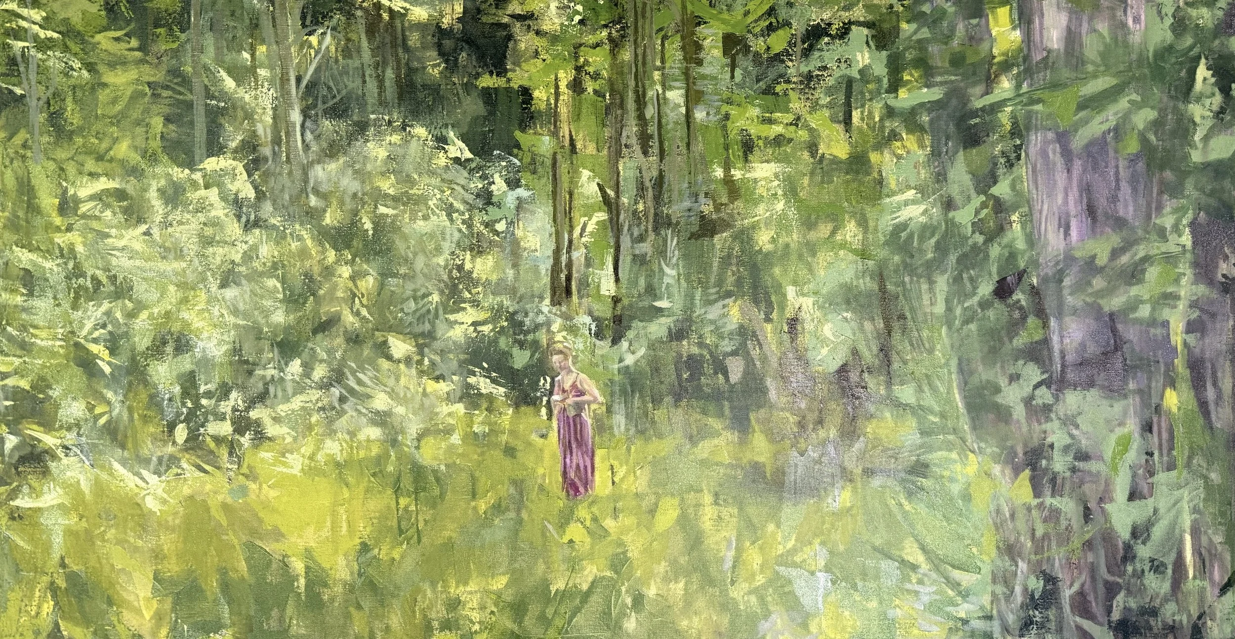
JANE MCKINNON JOHNSTONE | Concord, Massachusetts, USA
Murmurs of Hope
24x24”, acrylic on canvas, $500
Jane McKinnon Johnstone is a painter and a printmaker with a studio in Concord, Massachusetts. Her work is grounded in nature and expresses the spontaneity and vitality of growth with color and dynamic mark-making. She previously worked out of ArtSpace Maynard where she helped to establish and teach at the PrintWorks Printmaking Studio. She was a founding member of 6 Bridges Gallery in Maynard, Massachusetts. Her work has been exhibited in solo, juried and group shows in New England and is in many private collections.
Jane continues to seek out and learn from her fellow artists, art institutions and the natural world. She studied art at Decordova, Mass College of Art, Rhode Island School of Design, and the Zea Mays Printmaking Studio. She received her B.A. in English from Middlebury College and a Landscape Design Certificate from Harvard University.
Often found working in her studio or out gathering inspiration in the woods, on the river, by the ocean or in the mountains - she can be contacted at janemckinnonjohnstone@gmail.com and is available for studio visits.
CURATORIAL NOTES:
Jane McKinnon Johnstone’s practice as a painter and printmaker is deeply rooted in the rhythms of the natural world. We completely understand this as a a reciprocal relationship with nature. Her work emerges from direct experiences—walking among trees, listening to the quiet rustle of wind, taking in the subtle scent of earth and bloom, smelling crushed pine needles under foot—and carries that vitality back into the studio. In her hands, these fleeting impressions transform into dynamic color and mark-making that evoke the spontaneity we see in her work.
Just as Jane draws inspiration from the landscape, she also recognizes the importance of rooting herself in community, which we applaud. By engaging with her vibrant Concord surroundings and contributing to the local arts scene, she extends her creative energy outward, weaving connections that enrich both her work and the cultural life around her. Her practice reflects a balance between solitude and shared experience, where the natural and communal are equally essential sources of renewal. That is what this exhibition is all about, using those quiet moments as fuel and mindfulness.


BENJAMIN ERLANDSON | Sparta, North Carolina, USA
Green Bee
16x24”, photography, $1000
Dusted
16x24”, photography, $1500
Waking Up
16x24”, photography, $1500
Dr. Benjamin Erlandson is founder of an ecological educational nonprofit fostering bioregionalism, ecological literacy, and stewardship across the biosphere, an outsider scholar following dynamic inquiry to defy disciplines, practicing systems wisdom. Trained in narrative, photography, filmmaking, and new media production at UNC-Asheville (BA) and Emerson College (MA), he captures multimodal narrative traces in defiance of anthropocentrism and human exceptionalism. He was an NSF IGERT Fellow in Arts, Media, and Engineering at Arizona State University.
Recent juried exhibitions of his work include Spanish Peaks Arts Council, Photocentric Gallery, R Gallery, Valdosta State University, Spiva Center for the Arts, Hilliard Gallery, San Fernando Valley Arts & Cultural Center, Yeiser Art Center, Wilson Arts Center, Turchin Center, and Roger Tory Peterson Institute.
In 2025, he was a multidisciplinary artist-scholar in residence at Pine Meadow Ranch in Sisters, Oregon. Erlandson is also a volunteer photographer for the National Park Service on the Blue Ridge Parkway.
Erlandson combines natural light photography and timelapse to interpret natural and built landscapes across scales. These forms help us explore a sense of place for each of us within these spaces, within a single moment or across different time scales. The purpose of the compositions is to encourage us all to think beyond ourselves, our immediate surroundings, and shallow time horizons, expanding into something deeper and broader than what is an increasingly distracted frenetic existence (collectively and individually) on this planet we share with all species.
CURATORIAL NOTES:
Dr. Benjamin Erlandson’s nature photography invites us as viewers into his dialogue with the natural world, capturing more than fleeting beauty—it frames ecosystems as living visual narratives deserving of our careful attention and stewardship. Each image becomes a vessel for ecological literacy, translating the complexity of bioregions into visual experiences that foster awareness, empathy, and a sense of responsibility for the planet’s future. By tracing subtle patterns, rhythms, and interactions within the environment, his work goes beyond an anthropological perspective and encourages audiences to see through the eyes of a preservationist, where every wing, grain of pollen, shadow, and light shift carries lessons about resilience, interconnection, and the urgent need to honor the biosphere. We see these photographs are not just aesthetic moments; they are invitations to witness, reflect, and act.
Background Art: Vanessa R. Thompson, Salem, MA